As part of our critical essay and part of work of critical perspective, we had to do a Visual Poster about our critical essay. My critical essay was about superheroes of comic-books, more precisely about Iron-Man, so I started looking on internet for good images that I could use to create my poster. The programs that I have used were Photoshop and Indesign. Right Below you can see the final image and after that, all the passages from the first version to the final one with the notes about the process of creativity.
First Draft
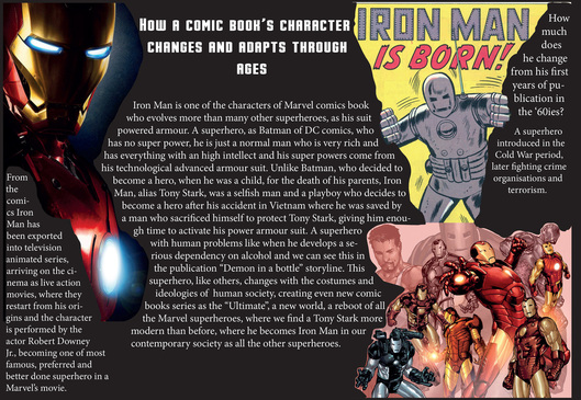
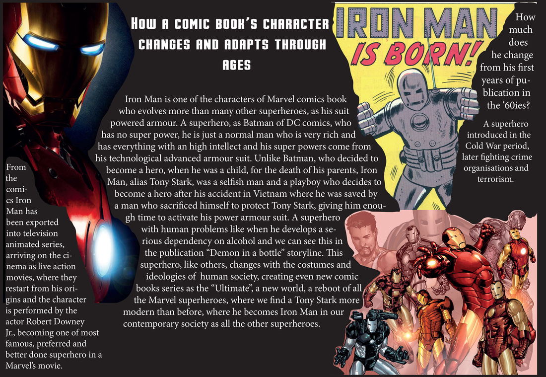
As a first attempt, I did using an horizontal format, using as a base color an almost black an putting on both sides some images of Iron Man old and new with most of the text at the center. The left image was a CGI image from the movie. The right one above was from one of the first cover of the comic-book. The one below is from more recent comic-books with most of the armor suits that Tony Stark had used since the first number. But the image did not work really well, it was so good.
Second Draft
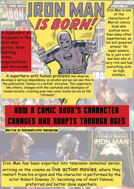
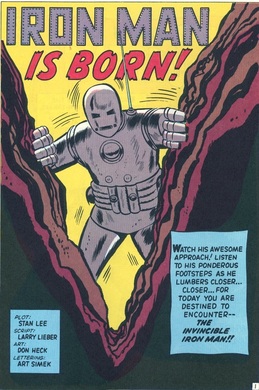
The second one is more near to the definitive one. This time I decided to use a vertical format and putting as background different covers and images of Iron Man, from some older to the more recent covers with an image of the second film of Iron Man too. I've taken the image of the first armor suit of Iron Man that looks like breaking the poster to go out. I liked the idea to give that impression. It was taken by a cover where he was passing through rocks and you can see it below.
Then thinking of the old covers, like this one above, I have decided to give it a Vintage look putting the text inside different captions of red and yellow like the colours of Iron Man's suit.
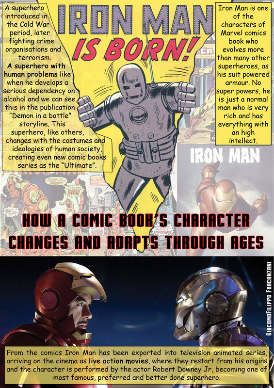
Final Poster
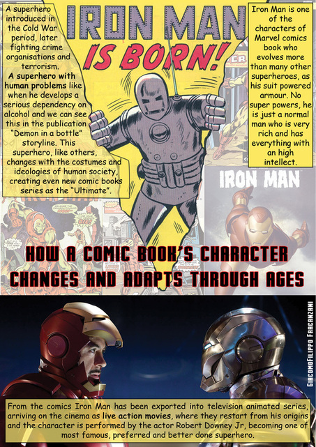
This one is the definitive poster. Even if the one before was not bad, that red and yellow could annoy the view, and cover too much the images behind them. So I've removed the red caption using only the yellow one. The colour red I have used it for the title to emphasize it and making it easier to read it. I've reduce the opacity on two of three captions so it was less annoying the colour and also a bit more visible the images behind. For the bottom I've decided to use just the image of the second movie without opacity, as I did on the second draft, so I could give importance to the films too.
If you want to see the images bigger you can see them on the gallery below.


 RSS Feed
